
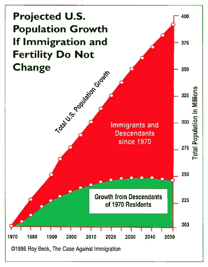
Desert Invasion - U.S.U.S. Population & immigration Data, Projections and GraphsWhat is causing population growth and associated sprawl across the U.S.? The Census Bureau projects that U.S. population will double within the lifetimes of children born today. 90% of this doubling will be due to mass immigration - that is, due to new immigrants and their descendents. The following graph shows that even though the U.S. had started to achieve a stable population in 1970, mass immigration is driving our population ever upwards. |
Sources: US Census Bureau; demographer Leon Bouvier; Roy Beck, Numbers USA |
|
The top line of the above graph shows actual US population from 1970 to 1993, and
the US Census Bureau "medium projection" of total population size from 1994 to 2050.
It assumes fertility, mortality, and mass immigration levels will remain similar to 1993.
In fact, overall immigration has continued to rise significantly, meaning that population growth
will actually be higher than shown here.
The green lower portion of the graph represents growth from 1970 Americans and their descendants. There were 203 million people living in the US in 1970. The projection of growth in 1970-stock Americans and their descendants from 1994 to 2050 is based on recent native-born fertility and mortality rates. This growth would occur despite below replacement-level fertility rates because of population momentum, where current and future children of the current generation will grow up to have their own children, all during the lifetime of the current generation. Nevertheless, this segment of Americans is on track to peak at 247 million in 2030 and then gradually decline. The red upper portion of the graph represents the difference between the number of 1970-stock Americans and the total population. The tens of millions of people represented by this block are the immigrants who have arrived, or are projected to arrive, since 1970, plus their descendents, minus deaths. They are projected to comprise 90% of all US population growth between 1993 and 2050. See the NumbersUSA website at www.numbersusa.com for a more thorough and interesting presentation of these facts - view the topics presented on the right side of the page. |
The following table shows how the current level of mass immigration vastly exceeds traditional levels.
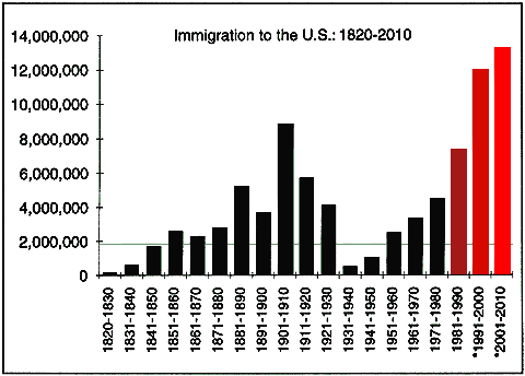
* Projections and graph courtesy Population Environment Balance, email uspop at balance dot org Sources: US Census Bureau; Statistical Yearbook, Immigration and Naturalization Service Averages: 178,000 per year from 1925-1965, 195,000 per year from 1921-1970 |
| History shows the U.S. has traditionally allowed relatively small numbers to immigrate, thus allowing for decades of assimilation. After the peak of about 8.7 million in the first decade of the 20th century, numbers went steadily down. Immigration averaged only 178,000 per year from 1925 through 1965! |